BOOTCAMP PROJECT
Wayfarer Website Design
An AI-Powered Travel Research Platform For Young Adventurers

Problem Statement
Wayfarer is an AI-powered travel research tool targeting adventurers aged 21-30. It needs a homepage to showcase its services and foster user engagement. Additionally, it requires a online form to gather user data to enhance its AI-driven personalization of travel recommendations.
Objectives & Goals
Design a homepage that showcases Wayfarer's services, ensuring it is clear, modern, and visually appealing.
Design an efficient, easy-to-use form to capture required user data.
Design Process
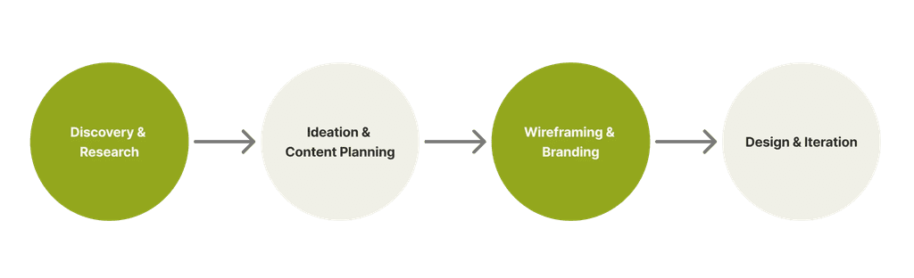

Competitor UI Analysis


5/5 paired destinations and activities with real photos for a direct visual impression.
5/5 incorporated a large amount of imagery throughout the website to create an engaging, exciting ambiance.
4/5 used icons and illustrations to complement the text and reduce reading fatigue.
5/5 employed bold, modern sans-serif typography to enhance readability.
5/5 utilized vibrant, friendly colors and a minimalist aesthetic for a visually pleasing experience.
Simple, straightforward use of icons
Compliment destinations/activities with real photos
Use multiple images to create strong ambience
Homepage Wireframes


Form Wireframes
The number of questions can make the process lengthy and potentially intimidating. The goal is to balance data collection with user experience.


Travel Preference
Personal Information

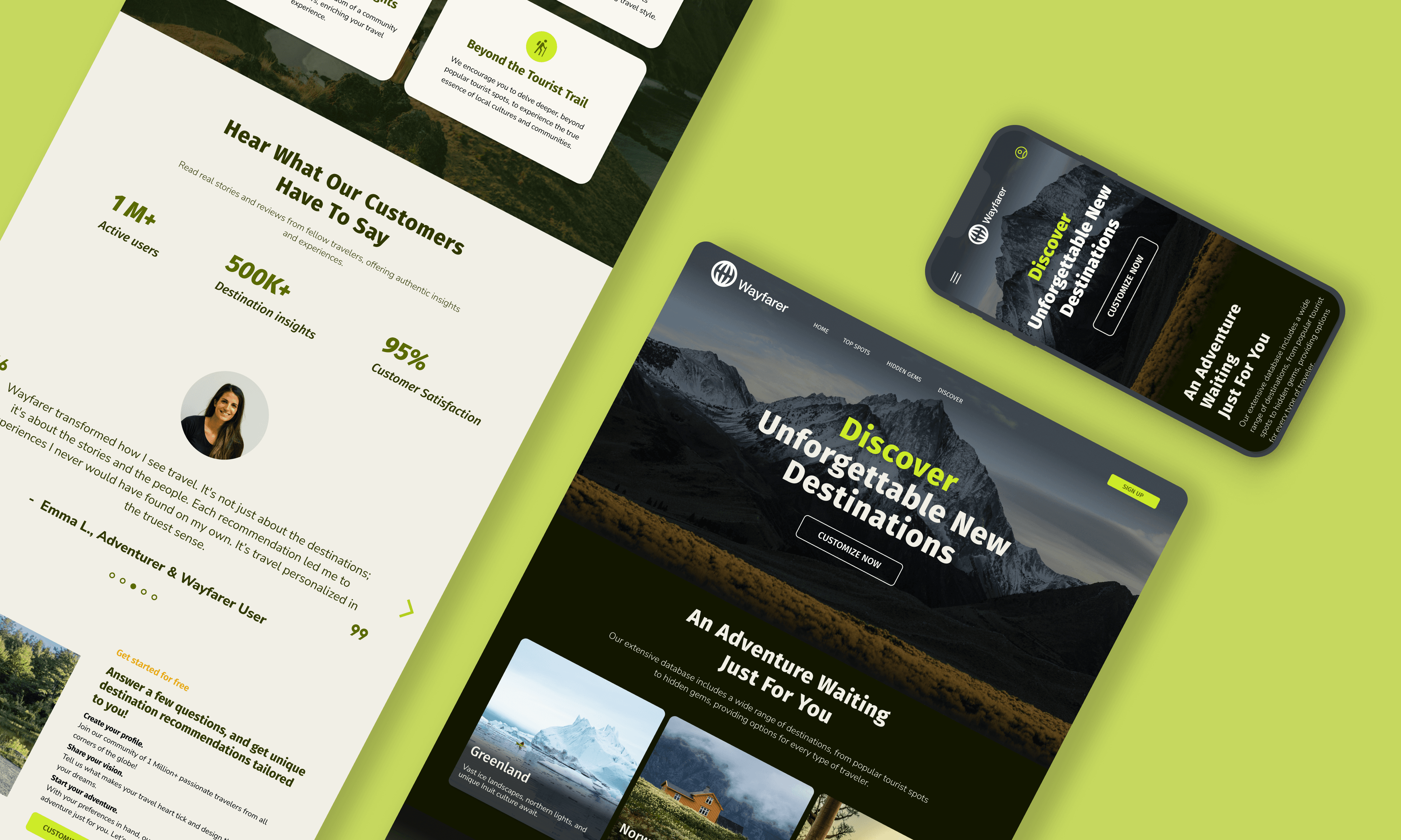
Major Screens
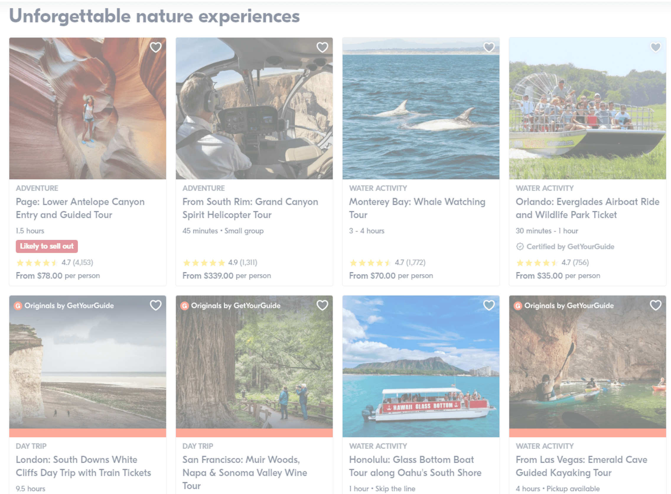
Homepage


Header with photos of destinations & CTA
Navigation Bar & CTA for quick sign up
Self-playing carousel gallery to showcase offered destinations
Unique features offered by the platform
Customer testimonials
Service instructions to set expectations and reduce uncertainty
Social proof
Destination details & keywords
Card display for better clarity
Final CTA to reinforcing the primary goal of conversion
Travel Preference Form
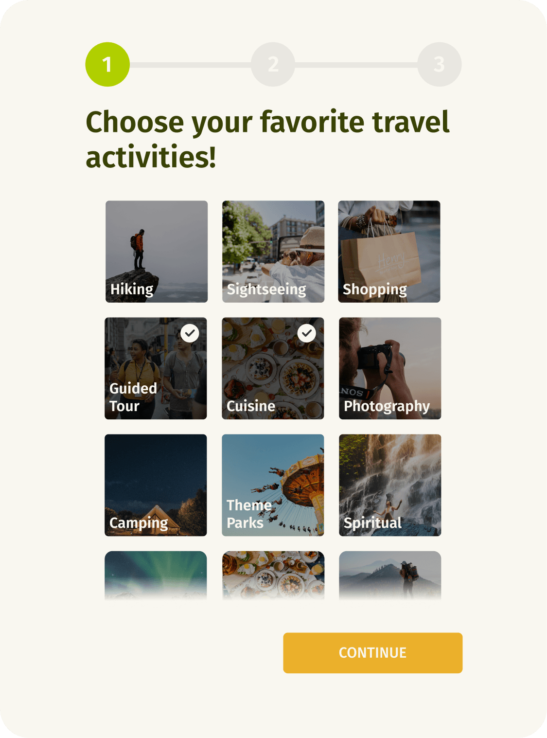


Use images to represent choice options, minimizing reading effort.
Progressive disclosure help users to concentrate on relevant tasks.
Rating scale to avoid the cognitive load of open-end questions.
Progress indicator
Icons as complements to text
Back button for error correction
Final Designs